Chordia is derived from the word ‘chord’, which is a musical note that sounds pleasant when several are played together.
Chords are a series of overlapping tones that sound beautiful to the ear. Our company name reflects our desire to efficiently develop revolutionary new drugs in the field of oncology by overlapping the passion and relentless efforts of each and every one of our members toward new drug development with the support and generosity of people outside the company, just like a chord creating beautiful tones.
Our corporate colors selected from PANTONE Color are Navy Peony as the main color and Greenery as a sub color. Navy Peony is a dependable and anchoring shade, and Greenery is a refreshing and revitalizing one.
Greenery was the Pantone Color of the Year 2017, which is also the year that Chordia was started.
Logomark is designed by Nonoka Imai
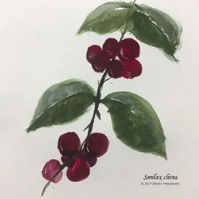
Our corporate symbol is derived from the leaf and fruit of the China root (Smilax china).
Along with representing the indomitable spirit in the language of the flowers of the China root, its leaves are likened to us being close with our patients, and its fruits to the pharmaceuticals that we deliver to patients.